Good Logo Design
The apple logo is a visual representation of the company for a number of
reasons. It is a very plain silver color, which is the color of the original
iphone’s aluminum backing. It also has very smooth edges with nice curves. This
is an ode to the ergonomic design direction of all Apple products. They are all
super slim, have smooth edges, and a very minimalistic design much like the
logo. Apart from the logo being instantly recognizable due to Apple’s marketing
expertise, it is the logo version of an iPhone, it is slim, sleek, and
minimalistic


The automotive brand, Jaguar also has a very striking logo. The
majority of their cars are sporty, fast, loud and aggressive. This logo conveys
all of those attributes. The animal in the middle seems to be flying right at
you, which hints at their car’s characteristics. The color red is also a color
of anger or love. This connects the “angry” characteristics of the speed that
their cars can achieve, and the loud noises the engine makes. It can also be a
symbol of how people often fall in love with cars that obtain those characteristics.
The expression on the face of the Jaguar also conveys those feelings of
aggressiveness.

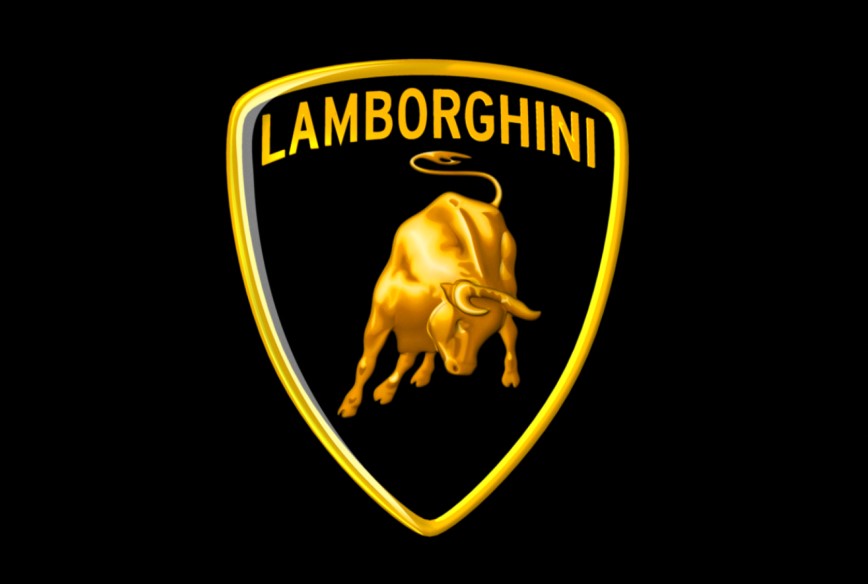
Lamborghini has possibly one of the most interesting logo’s in the
automotive industry. It depicts a bull which looks like it is going to gore
someone or something. The bull is an immensely powerful animal, just like how
the Lamborghini is an insanely fast car. The bull itself is very masculine, and
the horns are highlighted so that no one mistakes it for a cow. This connection
can be made with the styling of these cars, nobody ever mistakes a Lamborghini for
a Toyota. Lamborghini makes very masculine cars with straight-line styling, big
engines and sometimes un-tamable power, just like how you can’t tame an angry
bull.
The Buffalo Sabres logo is a strong one because of its
simplicity and literal depiction of the name. It literally spells out the name
of the team visually. Your eye reads from left to right, and top to bottom. So when
you read this logo, your brain tells you “Buffalo” and “Sabres”. It is
impossible to not understand this logo, even if you are unfamiliar with
professional hockey. The legibility of the design is also very strong. There is
no mistaking that the animal is a Buffalo, mostly because of the horns that are
clearly addressed. The swords are also easily distinguishable.
Spyker is a very small Dutch car manufacturer. They take a lot of ideas
from the aviation industry, including a heavy use of aluminum. This logo is
very clever in the ways that in communicates its purpose. You see the wheel and
tire, which communicates to you that it is something automotive related. And then
you see that there is an airplane propeller right in the middle of the wheel. These
two simple design elements communicate very well what the company does, and
where they draw their inspiration from. The Latin saying at the bottom
translates to “For the tenacious, no road is impassable”. This is a great
message for a company who provides hand built, one at a time, super sports
cars; they have to be tenacious if they want to succeed in the automotive
manufacturing business along with the other major car

Comments
Post a Comment